Lexmark
COMPANY: EPAM (EMPATHY LAB) / CLIENT: LEXMARK / ROLE: UX RESEARCH & DESIGN / AWARD: WEB MARKETING AWARD
Lexmark is a top enterprise-level printer manufacturer. The goal was to re-envision the B2C & B2B global & US product discovery & eCommerce experience, leveraging the ATG platform & partnering with Professional Services, an SI partner.
I lead the entire multi-year Design effort from strategy to production & facilitated client & SI partner collaboration. I developed comprehensive B2C / B2B sitemaps, user flows, & wireframes (US & global), directed usability testing, & collaborated on visual designs.


Sitemap
B2C IA & user flows

Global Experience
B2C eCommerce strategy

3 Experience Types
Country-level experience models

Homepage
Highlighting key analytics driven areas: Targeted promotions, Ink & Toner, Audience Triage, and Service & Support links

Visual Megamenu
Research revealed that users didn’t always understand the differences between All-in-ones, multifunctions, etc. but could recognize them visually

Top Category Page
Simplified category page hierarchy

Single Category Page
Surfacing both faceted navigation relevant to the product category as well as interactive Printer tool & merchandizing categories (featured, new, etc.)

Product Comparison
Interactive tool to enable easy product comparison

Product Detail
One of the most important experience areas on the site

Added to Cart
With product upsells (more on that later…)

Shopping Cart
Ensuring eCommerce best practices through shipping / tax calculator

Checkout Flow
Wireframe

My Account
Wireframe

Megamenu
Final visual comps

Product Detail
Final visual comps

Usability Testing
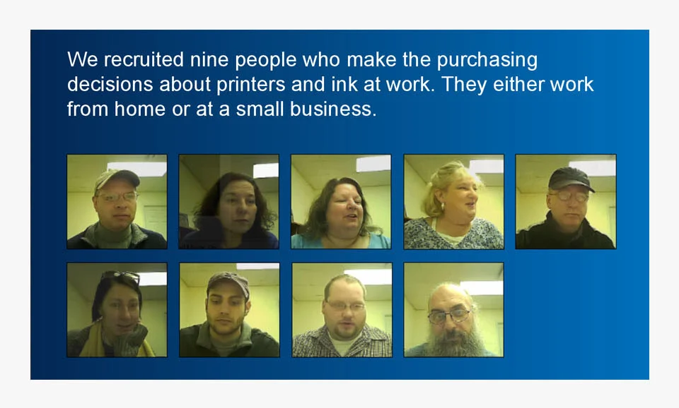
Participants

Usability Testing
Findings

Usability Testing
Recommendations

B2B Strategy
Sitemap & user flows

B2B Catalog Homepage
Custom experience for business partners

B2B Product Page
Refocusing on technical information
